
Interface Paradigm is Shifting | 매거진에 참여하세요
Interface Paradigm is Shifting
#multimodal #UXdesign #input #output #senses #contextual #reaction


For years, digital UX has revolved around two main pillars: text input and touch interactions.
Ever since smartphones became mainstream, these modalities have shaped how we design, develop, and interact with services.
But now, that foundation is being challenged.
The Limit of Text-Based UX
We’re approaching the ceiling of what screen taps and text boxes can offer.
In a world overflowing with sensors, cameras, and AI, both how we input and how the system responds are becoming far more diverse.
This is where multimodal UX enters the scene.
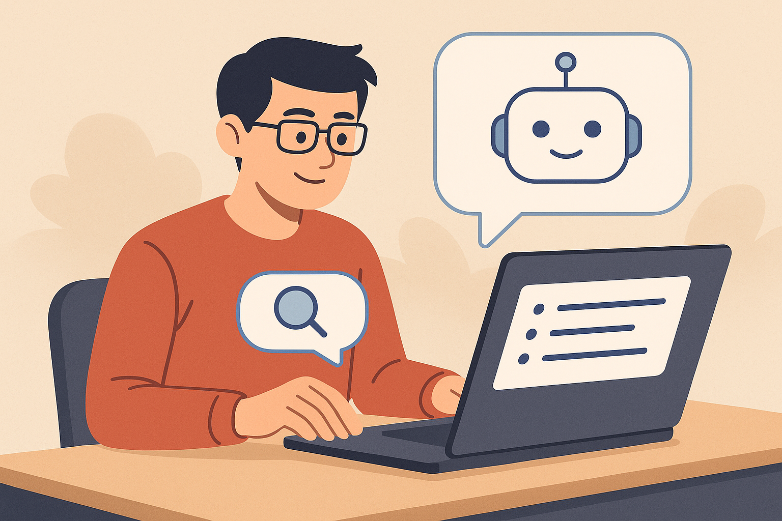
What Is Multimodal UX?
Multimodal (literally “many modes”) refers to systems that allow users to interact using multiple input and output channels simultaneously
— not just clicks or text.
Think:
- Voice commands
- Hand gestures
- Eye movement
- Device location
- Camera object recognition
- And even facial expressions
Imagine looking at an object and asking, “How much is this?”
— the system identifies the object via camera, understands your voice, and shows the price. That’s multimodal.
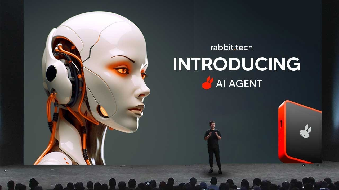
Devices Leading the Charge
The paradigm shift isn’t theoretical.
Devices like Humane AI Pin, Rabbit R1, and Apple Vision Pro are already reimagining interaction from the ground up.
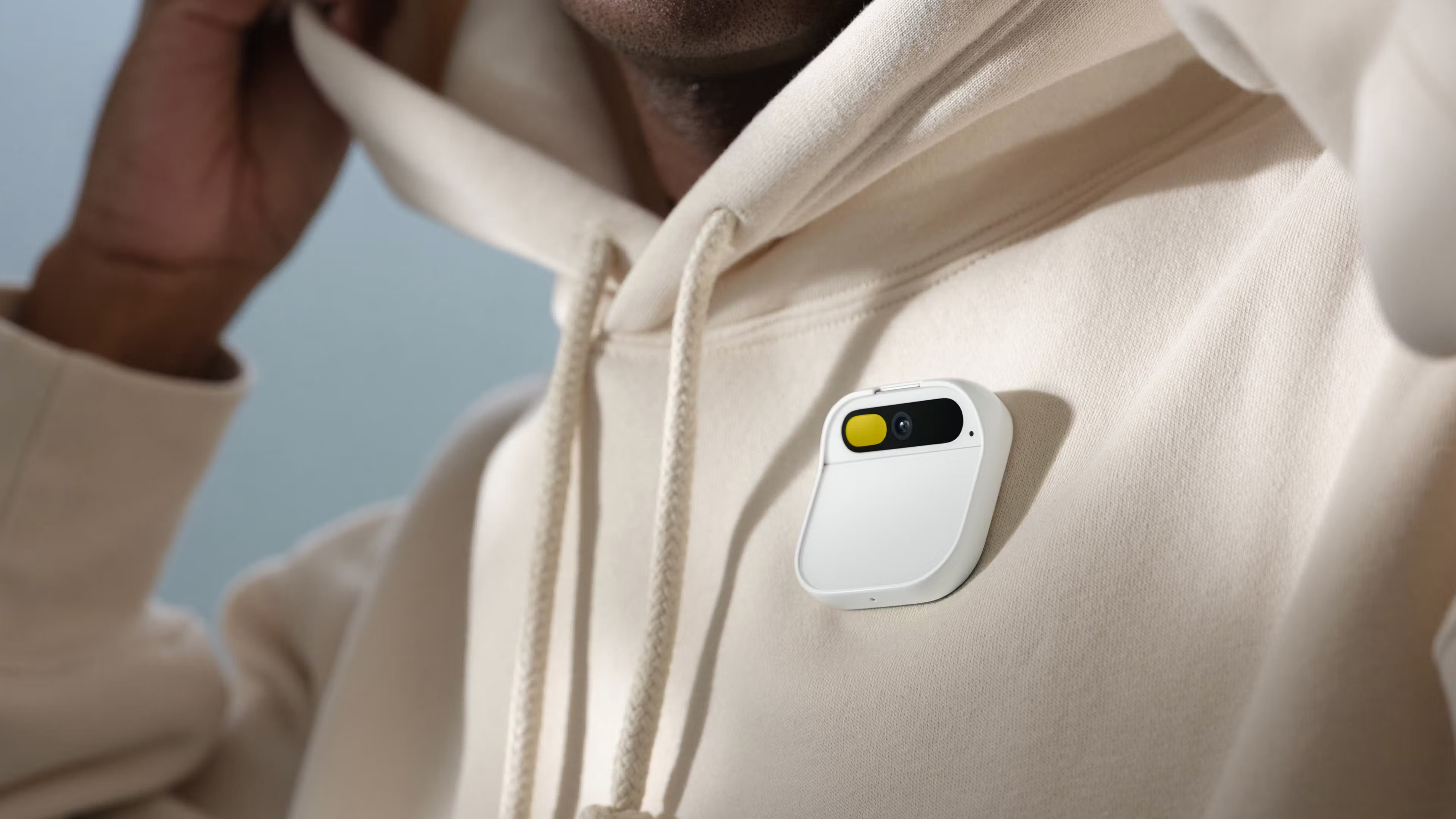
These products ditch the old “open app → press button” flow. Instead, they’re introducing new interaction logic:
- Voice-first navigation
- Gesture-based selection
- Context-aware responses
- Spatial computing
Apple Vision Pro, for example,
tracks your eye movements and finger gestures to let you control apps — no traditional touchscreen needed.
Questions UX Designers Must Ask
Here’s the twist: more input methods ≠ better UX by default.
Designing for multimodality is less about adding channels and more about choosing the right one for the right context.
So, product thinkers must start asking:
- In what situation will the user access this feature?
- Which input method feels most natural and frictionless in that situation?
- What kind of response will the user expect — visual, auditory, haptic?
- Multimodal UX isn't about convenience. It's about intentionality.
UX Flows Must Be Reimagined
Traditional UX was structured around screens and clicks.
But in a multimodal world, context and intent drive design.
Take a weather app, for instance.
Old flow:
Open app → choose city → scroll through forecast
Multimodal flow:
Ask “Do I need an umbrella today?” → system checks your location, local forecast, time of day → replies via voice:
“Yes, light showers expected around 5 PM.”
It’s a conversation, not a transaction.
It’s Not Just Input — Output Changes Too
In multimodal UX, feedback channels also evolve.
Gone are the days when plain text on a screen was enough.
Now we mix:
- Visual feedback (icons, animations)
- Auditory feedback (voice, tones)
- Haptic feedback (vibrations)
Depending on the user’s state — walking, driving, wearing AR glasses — a subtle vibration or a spoken cue might be more effective than a popup.
Good multimodal design blends all these channels into a coherent, intuitive response.
Multimodal UX Changes the Emotional Temperature
At its core, multimodal UX isn’t about flashy tech.
It’s about building human-first interactions — ones that respect our senses, context, and emotional bandwidth.
The UX designer of tomorrow isn’t just arranging elements on a screen.
They’re orchestrating a sensory experience.
They’re designing presence, fluidity, and empathy into every interaction.
Welcome to a new era.
The screen is no longer the stage — life is.
Multimodal UX is not just a trend.
It’s how technology starts to feel human.
Ref: bunzee.ai

- link_kakaolink_kakao_url
- link_operatorlink_operator_url
- link_investhelp@letspl.me
- link_ad_urllink_ad
